LOGO DESIGN
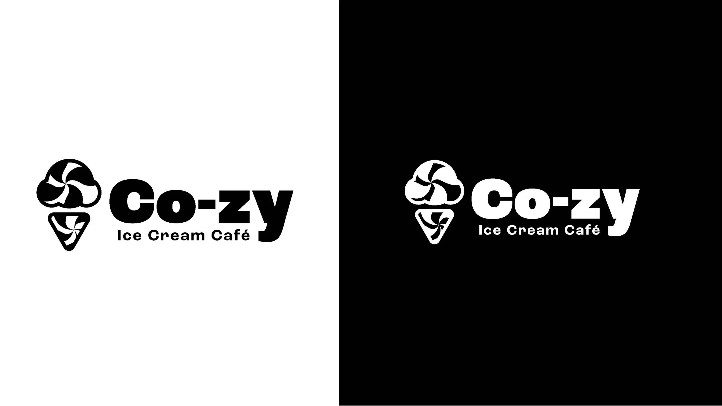
I created the Co-zy logo for an ice cream cafe that was all about the overall experience. Set to be located in downtown Providence, RI. They wanted customers to feel energized and comfortable in their space. While at the same time, bringing in the whimsy element ice cream brings to the table.
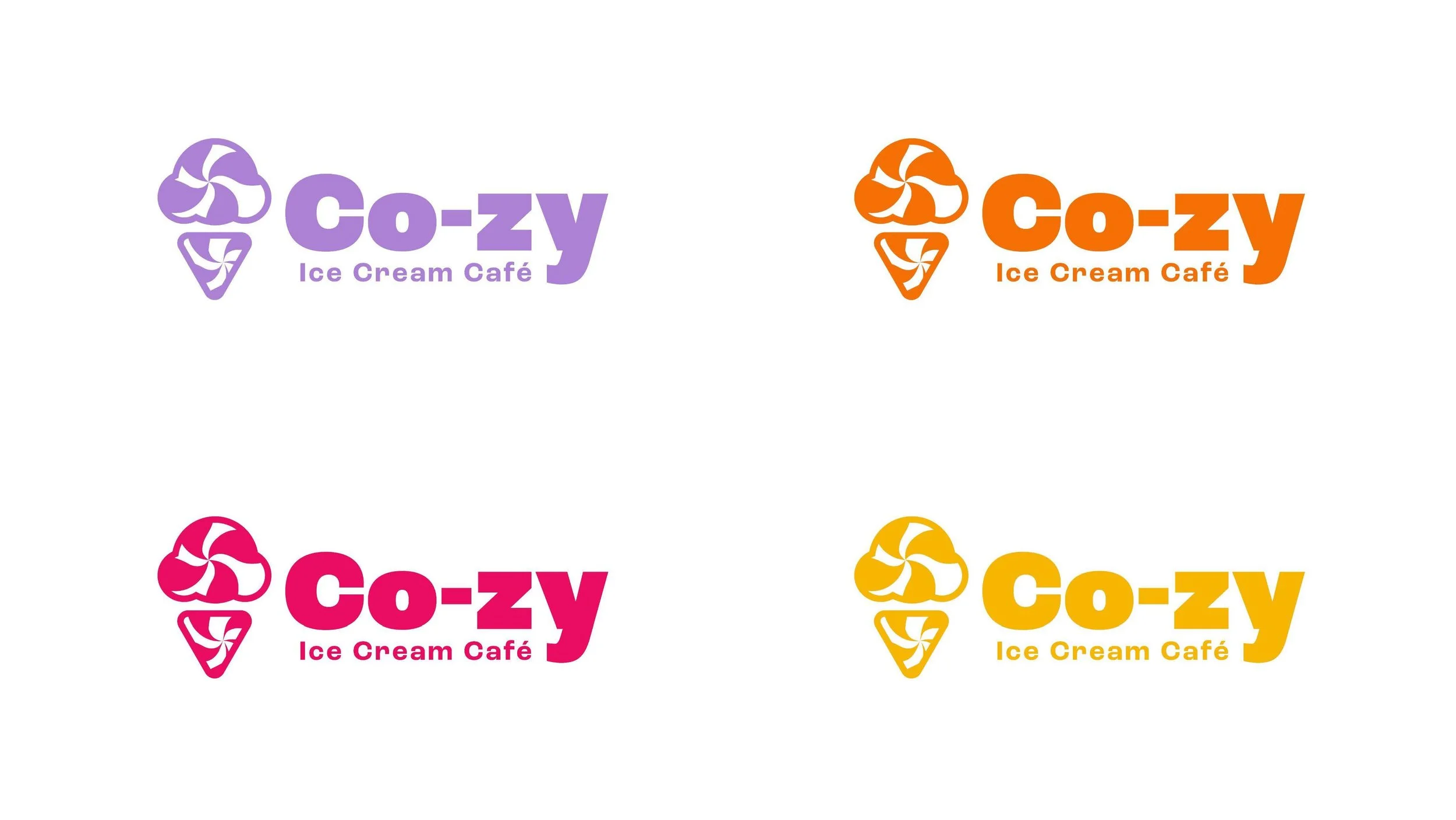
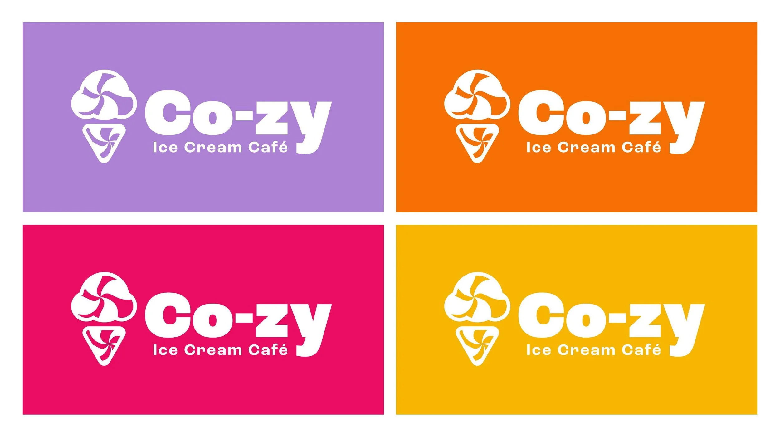
VARIATIONS
The ice cream graphic is playful with a twist! Paired with a friendly font to welcome all customers into the experience. This logo aligns with the whimsical essence of the ice cream industry.

POP OF COLOR
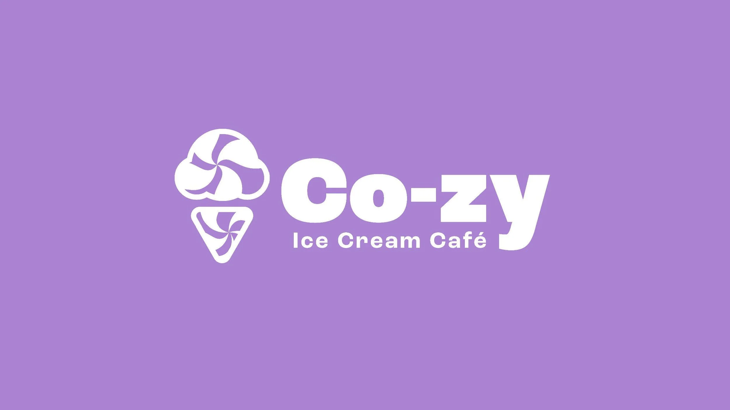
Ice cream is about connection and having fun! I wanted that to be translated immediately upon seeing the brand. I pulled in a warm color palette to emulate “cozy” and then added in the purple for a bit of balance. I designed for the main clientele of downtown Providence, RI.
Although the start-up fell through, I was grateful to get the creative juices flowing and build this identity.